Identity — the
names, marks, and one parrot.
Beora is a wordmark, not a logo. CareWiki is a wordmark, too. Both live on bone, in ink, with one coral note. The mascot — the parrot — is the warmth. Use these in this order: wordmark first, mark when space is tight, mascot when there's a face to show.
The Beora wordmark
Gambarino italic, lowercase, single weight. The wordmark is the brand. Don't tighten it, don't expand it, don't bold it, don't put it in a circle — those moves belong to the mark, below.
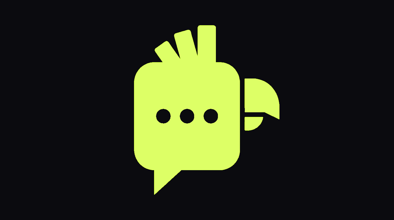
Anatomy
The Beora mark
The wordmark "beora" doesn't survive below ~14px. When space is tight — favicons, app icons, attribution in lockups, partner footers — use the b-mark. Four approved forms below. Outline + coral disc are canon.
Note: M·01 and M·02 are the everyday default — disc on light surfaces, outline on dark. M·03 is for monotone print or stamps. M·04 is for inline use only (e.g. CareWiki "by Beora" attribution).
Sizes
The CareWiki wordmark
CareWiki is the LLM-Wiki for behavioral health — the reference layer underneath the Beora agent. The wordmark is Space Grotesk lowercase, two-tone: care in ink, wiki in muted gray. It is more clinical than Beora because it's quieter — Beora gets to use Gambarino italic. CareWiki doesn't.
Whenever space allows, ship CareWiki with the canonical lockup: "by beora" stacked beneath, hairline above, Gambarino italic on the parent name. The lockup is the rule. The wordmark alone is the exception.
See the full CareWiki wordmark exploration for the six options we considered, lockup variants, and reduction tests.
The mascot
 CORAL · DEFAULT
 TANGERINE · ALT
 ACID · CAMPAIGN
BONE · INVERTED
ACID · CAMPAIGN
BONE · INVERTED
Misuse
Six things never to do to the wordmark. If you find yourself reaching for one of these, the system is asking you to use the mark instead.